5 Perfect Wedding Color Combinations for 2026


Why Color Combinations Matter More Than Single Colors
A wedding color is just a starting point. A wedding color combination — usually two or three colors that work together — is what actually shows up on linens, florals, stationery, attire, and signage. The couples whose weddings photograph beautifully are not the ones who picked the trendiest single color of the year. They are the ones who picked a combination where the colors balance, complement, and stay coherent across every visible element.
The five combinations below are the ones that consistently photograph well, work across multiple venue types, and have proven staying power. Each comes with realistic 2026 pricing for a 150-guest wedding, the flowers that hold the palette through a full day, and the venue tones that work best with each pairing.
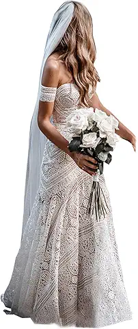
Combination 1: Blush, Champagne, and Soft Gold
The safest of the five and still one of the most beautiful. Blush carries the romance, champagne provides the warmth and softness, and gold adds dimension without leaning bright. This palette works in nearly every venue type and across every wedding style — from ballroom to barn, from elegant to relaxed.
Best flowers: garden roses, juliet roses, ranunculus, lisianthus, dahlias in late summer. Pair with eucalyptus and dusty miller for greenery. Skip baby's breath, which can read budget in a luxe palette.
Risk: looking generic. Avoid that by leaning into texture — raw silk linens, real-flower petals on the head table, warm brass candle holders rather than bright gold ones. Florist budget: $4,000 to $6,500.
Combination 2: Sage Green, Cream, and Warm Wood
The garden-and-orchard palette of 2026, and the most-requested combination at outdoor venues. Sage carries the freshness, cream keeps it elegant rather than rustic, and warm wood (in tablescapes, signage, and chairs) provides the third tone that makes the combination feel intentional rather than minimal.
Works beautifully at vineyards, gardens, orchards, and any venue with mature trees or natural greenery. Avoid at urban or industrial venues — the natural palette can read flat against concrete and steel.
Best flowers: white garden roses, ivory peonies, lisianthus, white dahlias, eucalyptus, olive branches, smilax. The greenery does much of the work, which is part of what makes this palette cost-efficient — expect $3,200 to $5,000 for full design.
Combination 3: Navy, Burgundy, and Antique Gold
The most dramatic of the five, and the right call for fall and winter weddings. Navy provides the structure and grounding, burgundy adds richness and warmth, and antique gold (matte rather than shiny) ties them together without going formal-stuffy. Works exceptionally well at ballroom venues, libraries, historic mansions, and any venue with rich wood paneling.
Best flowers: burgundy dahlias, deep red roses, dark calla lilies, plum scabiosa, with eucalyptus and dark greenery (italian ruscus, magnolia leaves). Skip pastel filler flowers, which fight with the deep tones.
This palette is the most photograph-flattering for evening receptions — the dark colors absorb light beautifully and create a moody, cinematic look in candlelit photos. Florist budget: $4,500 to $7,500. Burgundy linens carry a modest premium over standard white.
Combination 4: Dusty Blue, Ivory, and Silver
The cool-toned alternative to blush and champagne, and an ideal palette for spring and early-summer weddings at coastal or modern venues. Dusty blue is gentle enough to feel romantic but distinctive enough to avoid the generic-blush trap. Pair with warm ivory rather than pure white to keep the combination from going icy, and use silver in small doses (candle holders, flatware accents) rather than as a dominant tone.
Best flowers: white hydrangea, blue thistle, dusty miller, white garden roses, delphinium, lisianthus. Hydrangea is the workhorse here — it provides the volume that makes the palette read as full and lush even at a moderate budget.
Avoid at warm-wood and brick venues; the cool blue can fight with warm architectural tones. Best at white ballrooms, glass-walled venues, and beach or waterfront sites. Florist budget: $3,500 to $5,500.
Combination 5: Terracotta, Rust, and Cream
The 2026 sleeper hit. Terracotta and rust have moved from boho-trend territory into mainstream wedding palettes, especially at desert, garden, and mid-century modern venues. The combination is warm without going orange-bright, sophisticated without going formal, and photographs beautifully in golden-hour light.
Best flowers: peach and copper-toned dahlias, rust ranunculus, juliet roses, pampas grass (used sparingly — overuse dates the look), amaranthus. Pair with eucalyptus and dried-grass accents for texture.
Risk: tipping from earthy-elegant into rustic-overload. Keep the rest of the design clean — modern flatware, simple linens (cream or oatmeal, not patterned), minimal signage. Florist budget: $3,800 to $6,000. Pampas-grass installations can add $400 to $1,200 if you want a focal arch or backdrop.
Match the Combination to Your Venue
Before you commit, audit the dominant tones of your venue — the wood, brick, stone, paint, and greenery that will appear in every single photograph. Your combination should work with those tones, not fight them. Quick guide:
- Warm wood and brick venues: blush-champagne-gold, terracotta-rust-cream
- Cool stone or modern glass: dusty blue, navy-burgundy
- Garden, vineyard, and orchard: sage-cream-wood, terracotta-rust-cream
- White or neutral ballrooms: any of the five works — let the palette carry the entire visual identity
Once you choose, share the three colors with every vendor in writing — hex codes if possible, swatches if not. Florists, stationers, cake designers, and linen rental companies all work with slightly different color standards, and the only way to align them is to send the same reference.
The 70/30 Rule for Pulling It All Together
Once your palette is set, audit every visible category against it: linens, florals, ceremony backdrop, stationery, attire, cake, signage, favors. You do not need every item to match exactly. The formula that consistently photographs well is 70 percent in the palette colors and 30 percent in complementary neutrals (cream, wood, brass, soft greenery).
Resist the urge to add a fourth color partway through planning. The fourth color is almost always introduced because one specific element (a flower variety, a linen swatch, a piece of stationery) caught the bride's eye, and the cost of integrating it across the rest of the design rarely justifies the addition. Stick to your three. The strongest wedding designs are the most disciplined ones.