5 Wedding Color Trends to Watch in 2026


How Wedding Color Has Shifted in 2026
Wedding color in 2026 looks less like a competition between bold and neutral, and more like a deliberate move toward palettes with depth. The dominant trends this year share a single quality: they layer light and dark tones into combinations that read as intentional rather than decorative. The bride who picked one Pantone color of the year and built around it is being replaced by the bride who picks two saturated colors, one balancing neutral, and a metallic accent — a four-tone system that holds together across linens, florals, stationery, and lighting.
The five trends below are the ones showing up across mainstream bridal magazines, real-wedding portfolios from major US florists, and the early collection releases for spring and fall 2026. Each is paired with the venues, flowers, and seasons where the trend genuinely shines, plus a candid note on what to avoid when adopting it.
Trend 1: Moody Garden — Burgundy, Plum, and Smoky Green
The biggest mainstream shift of 2026. Where last year's garden palettes leaned bright (sage, dusty pink, cream), the 2026 version is darker, richer, and more cinematic. Burgundy and plum carry the depth, smoky eucalyptus and italian ruscus carry the green, and a single warm accent (antique gold or candlelight) pulls it together.
Best at: historic mansions, libraries, indoor venues with rich wood paneling, autumn outdoor weddings under mature trees. Avoid at: bright white ballrooms with no architectural texture, where the dark tones can read flat.
Best flowers: burgundy dahlias, dark red garden roses, plum scabiosa, dark calla lilies, italian ruscus, magnolia leaves. Florist budget for full design at 150 guests: $5,000 to $8,000.
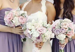
Trend 2: Modern Pastel — Butter Yellow, Soft Lilac, and Cream
Pastels are back, but not the pastels of a decade ago. The 2026 pastel palette is built around butter yellow as the lead color, with soft lilac as the secondary and cream as the foundation. The result reads spring-like and fresh without going saccharine, and photographs beautifully in natural light.
Best at: garden venues, brunch weddings, daytime outdoor ceremonies, spring weddings between mid-March and late May. Skip at: evening receptions and indoor venues with low light, where pastels can lose their definition.
Best flowers: butter-toned juliet roses, white ranunculus, lilac stock, pale yellow craspedia (used sparingly), white lisianthus, soft greenery like silver dollar eucalyptus. Florist budget: $3,500 to $5,500.
Trend 3: Coastal Neutral — Oyster, Driftwood, and Warm White
The 2026 evolution of the all-white wedding. Pure white has been replaced by oyster (an off-white with a faint gray undertone), warm driftwood tones in wood elements and signage, and warm white (rather than cool white) in linens and florals. The combination reads sophisticated and timeless, photographs cleanly across all lighting conditions, and is the safest of the five trends for couples who want a wedding that will not date.
Best at: beach and waterfront venues, modern indoor venues, any wedding where you want the focus on people and food rather than on bold design. The neutral palette flatters every skin tone and works with every venue.
Best flowers: white garden roses, ivory peonies, white lisianthus, white anemones with their dark centers (the only point of contrast), eucalyptus, olive branches. Florist budget: $3,200 to $5,200.
Trend 4: Sun-Faded Earth — Rust, Ochre, and Stone
The desert and mid-century modern palette of 2026, and the most distinctive of the five. Rust and ochre carry warmth, stone (a soft warm gray) provides the neutral, and the overall effect is warm, grounded, and editorial. This trend works best for couples who want their wedding to feel like it belongs to the landscape rather than imposing on it.
Best at: desert venues (Sedona, Joshua Tree, Marfa), mid-century modern indoor venues, late-summer and early-fall weddings, vineyards in their fall color phase. Avoid at: traditional ballrooms with crystal chandeliers, where the earth tones will fight the formal architecture.
Best flowers: copper-toned dahlias, rust ranunculus, juliet roses, terracotta dahlias, dried-grass accents (used as texture, not as the main feature), eucalyptus and olive. Florist budget: $4,000 to $6,500. Skip pampas grass overload — it dated quickly and is now a tell-tale sign of an early-2020s wedding.
Trend 5: Jewel Tones — Emerald, Sapphire, and Antique Brass
The dramatic, evening-reception palette of 2026. Emerald green is the lead color (showing up in linens, florals, and bridesmaid dresses), sapphire blue plays a supporting role in stationery and accent pieces, and antique brass (rather than bright gold) ties the two saturated colors together. The combination reads luxe and confident, and photographs spectacularly under low light and candle.
Best at: evening receptions in ballrooms, lofts, and architecturally interesting indoor venues. Best season: late fall through early winter. Skip in bright midday outdoor settings, where the saturated tones can overwhelm.
Best flowers: emerald greenery (italian ruscus, magnolia, eucalyptus), white phalaenopsis orchids, deep red garden roses, dark calla lilies. Often used with green-and-white florals rather than green-and-color, letting the linens carry the emerald and the flowers stay neutral. Florist budget: $4,500 to $7,500.
How to Pick the Trend That Works for You
Pick the trend that matches your venue and your season first, your personal preference second. A modern-pastel palette in a dark, candlelit indoor venue will look washed out in the photos no matter how much you love the colors. A jewel-tone palette in a bright outdoor garden ceremony will fight the surroundings.
Quick matchmaker:
- Spring outdoor or brunch wedding: modern pastel
- Summer beach or modern indoor: coastal neutral
- Late summer or fall desert/vineyard: sun-faded earth
- Fall historic venue or moody outdoor: moody garden
- Late fall or winter evening reception: jewel tones
Once you have the family chosen, pick a four-tone palette: two saturated colors (or one saturated plus one mid-tone), one balancing neutral, and one metallic accent. Apply that four-tone system across every visible element and the wedding will read as designed rather than decorated.
Working With Vendors on Color
Once your palette is locked, share it with every vendor in writing — hex codes, swatches, or both. Florists, stationers, cake designers, linen rental companies, and bridesmaid-dress retailers all work with slightly different color standards, and the only way to keep them aligned is a single shared reference document. A $30 swatch set from a paper-goods or fabric retailer is the cheapest way to keep eight vendors on the same color.
Schedule a color meeting six to eight weeks before the wedding with your florist and your linens vendor in the same room (or on the same call). They are the two vendors most likely to misread a tone, and getting them aligned visually rather than via text is the single highest-leverage move you can make in the final planning sprint.