Wedding Attire Color Palette Guide for 2026 Weddings


Why Attire Color Planning Matters
Attire color is the visual thread that ties together every person in your wedding photos — the couple, the bridal party, the parents, and the grandparents. A well-coordinated attire palette photographs as intentional and elegant; a loose, everyone-picks-their-own-color approach photographs as chaotic even when each individual outfit is beautiful. The couples whose wedding photos look like magazine spreads are almost always the ones who thought about attire color as a single system rather than as a set of individual purchases.
The framework below treats attire color planning as a five-tier decision: the bride's dress tone, the groom's suit color, the bridal party palette, the parents' and grandparents' guidance, and the accent tones that appear across accessories. Each tier builds on the one before it. Get the tiers right in order and the full attire palette falls into place naturally.
Tier 1: The Bride's Dress Sets the Foundation
The bride's dress color (and undertone) is the anchor of the entire attire palette. Every other color choice should complement it. The bridal-dress tones most common in 2026:
- Pure white: crisp, modern, cool-toned. Pairs with cool-toned palettes (navy, dusty blue, sage).
- Off-white / diamond white: slight warmth without going champagne. Versatile across palettes.
- Ivory: warm, classic, vintage-leaning. Pairs with warm-toned palettes (cream, blush, burgundy).
- Champagne: distinctly warm, beautiful in golden-hour light. Pairs with champagne, terracotta, sage, dusty pink.
- Blush or pink-tinted: fashion-forward choice. Pairs with cream, rose gold, dusty pink.
Bring a swatch of your actual dress fabric (not a photo) to every subsequent color meeting — florist, stationer, linen vendor. Hex codes and photos do not capture the exact tone of bridal fabric, and small mismatches compound across the attire palette.
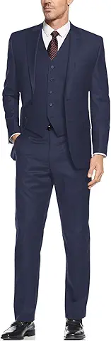
Tier 2: The Groom's Suit Complements the Dress
The groom's suit color should complement the bride's dress without matching it exactly. The suit-dress pairings that consistently photograph well:
- Pure white dress + navy or charcoal suit: crisp, classic, universally flattering
- Ivory dress + tan or light gray suit: warm, elegant, ages beautifully in photos
- Champagne dress + beige or stone suit: warm, earthy, cohesive
- Blush dress + dove gray or light tan suit: soft, romantic
- Any bridal tone + black tuxedo: formal, dramatic, correct for evening weddings
Avoid: matching the suit color exactly to the dress tone (reads costume-like), picking a suit color that competes with the dress for visual attention (bright saturated colors), and overformal tuxedos at casual outdoor daytime weddings.
Bring fabric swatches of both the dress and the suit together before finalizing either. The mismatch between dress undertone (cool vs warm) and suit undertone is the most common attire-palette mistake, and it only shows up when the fabrics are side by side.
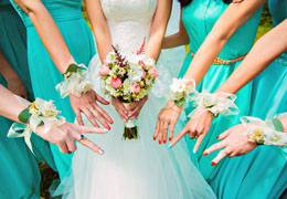
Tier 3: Bridal Party Palette
Bridesmaid dresses and groomsmen ties/pocket squares carry the wedding's primary accent color. This is where most of the color 'pop' in wedding photos comes from, and the choices that work:
- Monochromatic (all bridesmaids in one color): strongest, most uniform photos. Best for formal weddings.
- Tonal (bridesmaids in one color family, varying shades): softer, modern, flattering across body types. The 2026 default.
- Coordinated palette (multiple complementary colors): distinctive, intentional, hardest to execute. Pick 3 to 5 colors that work together.
Groomsmen tie/pocket square colors should coordinate with (not match) the bridesmaid dress color. If bridesmaids wear sage green, groomsmen wear navy suits with sage pocket squares — a small visual echo rather than identical fabric.
Avoid: bridesmaids in colors that clash with the bride's dress undertone (cool-toned dress + warm-toned bridesmaid dresses), colors that match the wedding flowers so closely that the bridal party disappears into the centerpieces.
Tier 4: Parents and Grandparents
Mothers, fathers, grandmothers, and grandfathers are in dozens of wedding photos — and without guidance, they often pick outfits that conflict with the palette. The parents' wedding attire generally works best when:
- Mothers' dresses align with the wedding palette but are not the same color as the bridesmaids
- Mothers of the bride and groom coordinate with each other (neither tries to match the bride)
- Fathers and grandfathers wear suits in navy, charcoal, or dark tones that pair with the groom's suit
- Grandmothers are offered the same color guidance as mothers but with grace for what suits them personally
Communicate the palette gently but specifically. Send each parent a simple note: 'We're leaning navy and champagne. Any variation within that palette works beautifully.' Do not dictate a specific dress; do make sure no one arrives in a saturated red or bright green that will pull focus in photos.
The classic rule: the mothers should coordinate with each other. If the bride's mother wears dusty blue, the groom's mother should wear a complementary (not identical) tone — cream, navy, or soft gold work well.
Tier 5: Accessories and Small Accents
Accessories — the bride's jewelry and shoes, groomsmen socks, pocket squares, boutonnieres, corsages, hair pieces — carry the wedding's secondary accent color. This tier adds depth and specificity without overwhelming the main palette.
The pattern that works: primary palette in the dresses and suits (70%), secondary palette in flowers and linens (20%), accent tone in accessories (10%). For example: navy and champagne as the primary palette, blush flowers and gold linens as the secondary, and a blush hair piece or navy boutonniere with gold stems as the accent.
Skip matchy-matchy execution. The bridesmaids should not wear bridesmaid dresses AND matching jewelry AND matching shoes AND matching hair pieces — the effect becomes costume. Pick two matching elements (dresses + shoes, for example) and let the rest vary within the palette.
Venue-Matched Color Guidance
The venue's dominant tones should shape the attire palette. Quick matchmaker:
- Warm wood, brick, or stone venues: ivory dress, warm-toned suits (tan, beige, charcoal), bridesmaids in terracotta, dusty rose, or sage
- Cool stone, glass, or modern indoor venues: pure white dress, cool-toned suits (navy, gray), bridesmaids in dusty blue, steel gray, or jewel tones
- Garden and vineyard venues: ivory or champagne dress, tan or olive suits, bridesmaids in sage, dusty rose, or soft pastels
- Beach and waterfront venues: pure white or champagne dress, light linen suits, bridesmaids in soft corals, blues, or whites
- Formal ballrooms: any bridal tone, black or midnight navy tuxedos, bridesmaids in deep jewel tones or black
The attire palette that photographs best at any venue is the one that blends into — rather than fights against — the venue's own tones. Match the attire to the venue and the wedding photos will feel unified.
Colors to Avoid
Some colors reliably underperform in wedding photos:
- Pure black bridesmaid dresses for daytime outdoor weddings (reads funereal; fine for evening)
- Saturated red for bridesmaids or mothers (competes with the bride)
- Neon or fluorescent colors anywhere (photograph poorly)
- Metallic silver or gold dresses if the palette is warm- or cool-toned (the metallic often clashes with the palette's undertone)
- Pure white on anyone other than the bride — including mothers, grandmothers, and guests
- Any color that matches the bride's dress tone too closely (ivory dress + ivory mother-of-the-bride reads as confusing)
When in doubt, lean toward muted, sophisticated tones. A bridesmaid in dusty rose will nearly always photograph better than a bridesmaid in bright coral. The 2026 palette wisdom: softer colors age better than saturated ones, and timeless tones beat trendy ones in photos that will last 50 years.